Saturday 1 June 2013

Why profit is the highest when marginal cost curve crosses the marginal revenue curve ( Competitive firm model )

     The definitions and the characteristics for the various terms need to be referred to a standard text book. 

This blog will discuss only the reason for why the profit is maximized when Marginal cost curve crosses the Marginal revenue curve.

Abbrevations

MC=    Marginal Cost                                                     MR=   Marginal Revenue
ATC=  Average Total Costs                                           TC=     Total Costs
AVC=  Average Variable Costs                                     TR=     Total Revenue
AFC=  Average Fixed Costs                                          P=        Price; Q=    Quantity
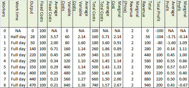
Consider the following example

The table below gives the details of a factory producing a certain unit of a product.

Table 1


It is mentioned in a previous blog, why marginal cost crosses the Average cost curves at their lowest points,  and how the marginal cost, which is a change in cost, actually affects all the average costs.

EXPLANATION

Consider the following plots, plot 1 and plot 2 derived from the factory data in table 1.


Plot 1


Plot 2


The Total Cost is equal to Average Total Cost  multiplied by the quantity, and Total Revenue is equal to Average Total Revenue ( equal to price or MR for a competitive firm) multiplied by the quantity. Total Profit is the difference between the two.

In Plot 2, Total cost is drawn as an area which is equal to ATC multiplied by Quantity. And Total Revenue is drawn as an area which is equal to ATR multiplied by Quantity. Total profit is the Total Revenue area minus the Total cost area.

For example.

For a Quantity H, the TC=     area EYHF
                                 TR=      area DIHF
                                 Profit=  area DIYE.

For a Quantity G, the TC=     area ABGF
                                 TR=     area DCGF
                                 Loss=  area ABCD

CONFUSION

1.       In theory the profit has to be highest at a production output where the marginal cost crosses the marginal revenue, which is at point Z. whereas, it can be clearly seen that the Average total cost is lowest at point Y. And also, marginal cost is lower at point Y, which is lower than at point Z.

2.       At point W, the marginal cost is the lowest, much lower than the marginal revenue. But the production is at a significant loss at the same point.

CLEARING CONFUSION 1

Consider the following plots 3 and 4. Plot 3 plots the Total Revenue and Total costs. And plot 4, plots the difference of Total cost and Total Revenue ie the profit.


Plot 3


Plot 4


From plot 4 it is quite obvious that the maximum profit occurs at point Z ( where the MC crosses the MR). It is also observable from plot 3.

REASON    

The reason for this confusion is that, MC as defined previously is a change in cost. The difference between AVR( the straight line of $2) and the ATC curve gives us Average total profit(AVP), and it is quite clear that AVP is the highest at the point Y where ATC is the lowest. We get confused because we think that the profit should be highest when the AVP is the highest. But AVP is only an average. Increasing the production from point Y to point Z definitely reduces the AVP. But it increases the total profits. AVP is reduced because, each quantity  produced after point Y yeilds lesser profits, bringing down the average. But  the total profit gets increased albeit with decreased rate. Even when the Average Total Cost is at its lowest when the production reaches point Y (370 units), we can still squeeze in more profit per unit, by producing until the production reaches point Z (440 units) . Until then, each change in cost/ unit (MC) is still less than the price for which those units can be sold. The increase in total profits becomes zero only when the production reaches point Z. This is quite clear in the Plot 5.

 The difference between MR and MC is called Marginal profit, whereas, the difference between ATR and ATC is Average profit. In order to maximize the Total profit, we have to go on producing until the marginal profit is diminished to zero. Since Average profit is just an average, it might be still be positive for many more units of production even after the production crosses point Z. For more clarity refer to plot 5.

                                                                             Plot 5


In Plot 5, we can see that the average profit is maximum at point Y, which is self explanatory.

CLEARING CONFUSION 2

Marginal Cost, Marginal Revenue and Marginal Profit  are also the slopes of the Total Cost, Total Revenue and the Total profit curves respectively.

So in this case, when Marginal Cost is at the lowest, the Marginal Profit is at the maximum. But the factory is in loss. It just says that the slope of the Total cost curve is at the lowest and is about to change, and the slope of the Total profit curve is at the maximum and is about to change. At this point the Total cost is not the lowest, neither is the Total profit the highest. This is amply demonstrated in the plots 3,4 and 5.


Friday 24 May 2013

Why the diminishing marginal utility curve has the same slope as the demand curve

Diminishing marginal utility states that, the marginal utility of a product diminishes with each unit of the product consumed.

This is because, the change in utility, when each unit of product is consumed, always decreases. ( refer to a standard text for more clarity)

ILLUSTRATION


Fig 1
Consider an example of ordering pizza, which costs one dollar a slice. If consuming the first slice gives 24 utils of utility, after eating the next one, the total utils increases to 36 utils. Refer to fig 1 for the complete pizza consumption.


You may notice that, had the price of a slice of pizza been $2, then the utility also reduces by half for each slice.

Fig 2
If we draw the total utility against number of slices consumed, the plot will look like fig 2


And therefore, if you plot the marginal utility in y axis and the number of unit consumed, in the x axis, you always get a curve with diminishing curve. This is called the diminishing marginal utility curve as illustrated in the fig 3 below.

Fig 3

If marginal utility of a product  is Mx at a price x, then Mx/x ie the marginal utility per dollar for that product should always be greater than that of any other alternative product, so that you may keep buying it.

So some one has to make you buy the same product  again and again, over every other alternative products, then the ratio Mx/x needs to be made constant, every time you consume the product.

Since marginal utility keeps on decreasing, while we consume the same product again and again, Mx decreases when more quantity is bought.

So inorder to keep Mx/x constant, the only way to do is the decrease the price, in the same ratio of decrease in Mx.

So the greater the price reduction, the more you will consume or demand. This is why the demand curve has the same slope as the marginal utility curve.

The demand curve is a plot produced, when the demand ( measured in quantity ) is plotted in x axis and the price plotted in the y axis.

The demand curve also has negative slope, ie the demand always diminishes when price is increased, keeping all other factors constant.

In the above pizza example, the demand curve would look like this


ILLUSTRATION

Product 1
let the marginal utility for a product be 100, 80, 60, 40, 20 for the first 5 pieces, and the price for the fifth piece is 20, then Mx/x for fifth piece is 1.

Product 2
If the marginal utility for another product be 100, 90, 70, 50, 40, and the price of the fifth piece is 20, then Mx/x for the fifth piece is 2.

If the seller has to make you take the fifth piece of the first product over that of the second product, then the marginal utility per dollar of the first product should be more than 2 ( marginal utility per dollar of the second product) . Ie the price of the fifth piece of the first product has to be reduced below 10 in order to make you buy the fifth piece of the first product over that of the second product.

This means that whenever you increase a price of a product, the demand diminishes.

Saturday 2 February 2013

Why Marginal cost curve crosses the Average Total Cost curve and the Average Variable Cost curve at their minimum point.

Refer to figure 1 given below.


                                                                        fig 1

All the data is taken from the chart in the blog on "Why the profit is maximised when the marginal cost curve crosses the marginal revenue curve"

Facts to consider

1. Average total cost curve is a plot of the average total costs for all the different quantities starting from zero production. The X axis is the quantity, and the Y axis is the ATC. This curve first slopes downward, then reaches a bottom and then slopes upward.

2. Average variable cost curve has the same characteristics of the ATC curve, but always stays below the ATC curve at all the points. The difference between the values of the curves is the fixed cost.

3. Since all the three curves has quantity in the x axis, all of them can be drawn together. The MC curve also first slopes downward, reaches a bottom and then starts sloping upward. The MC curve first crosses the AVC curve and then the ATC curve at their respective bottoms. Refer to a standard text on the problem.

TC       :                   Total cost
dTC     :                  Change in total cost
VC      :                   Variable cost
ATC    :                  Average total cost; AC is the average cost
dATC  :                  Change in ATC
AVC   :                  Average variable cost; VC is the variable cost
dAVC :                   Change in AVC
FC      :                   Fixed Cost.
Q        :                  Quantity.
dQ      :                  Change in Quantity.
MC     :                  Marginal cost.
MC    =                 dTC/dQ
TC     =                  VC + FC
dTC   =                  dVC+dFC

But since FC is the fixed cost and by definition does not change, dFC = 0

So dTC=dVC

So MC = dVC/dQ

            This means that marginal cost, which is the change in total cost per unit of quantity is actualy caused by the change in variable cost only. Now here the question is why the marginal cost curve crosses the Average total cost curve and the Average variable cost curve at their respective bottoms.

             Consider the average of height in a class. Whenever a new student joins, the average changes. If the height of the new student is the same as the present average, then the average does not change, if it is less the average decreases, if it is more the average increases. 
           
             Similarly, the marginal cost is the next new comer. Marginal cost is the next change in the cost (per unit). This next change, if it is more than the average, then the average will increase or vice versa.

             Since MC = dTC/dQ = dVC/ dQ. The new comer is same for both the averages TC and VC.
So, both the AVC and the ATC curve decreases and increases due to the new comer entry MC.

            Now, in the portion of the curves, where they have a downward slope, before they hit their bottoms, the marginal cost values are lesser than than the respective values of the average curves. So the lower MC values drags the averages down. Now when the MC curve, which hits the bottom of its own, slopes upward and first crosses the AVC curve. At the crossing point MC value = AVC value. And after that the MC values drags the AVC curve upwards. This is also what happens to the ATC curve.

            Note that MC is the new comer for both the the averages as we proved earlier.